Thursday 15 March 2012

The PoWeR oF GeOMeTrY !!!

Wow !!! This video is hypnotising !! The effect are incredible !! I love the symmetry and the motion created ! 
The lighting techniques and the set-up enhances this clip. 


SHades of grey , blues and a touch of green and red !!! 


The way French monuments are projected and multiplied and divides and put in symmetrical views !!!! My favorite is the effect on the Notre Dame building !!!!!!!!!!! 

Saturday 11 February 2012

TurN oN ThE LigHts


Chicago will be bright and shiny at night ! Anish Kapoor's  reflective structure  ‘Cloud Gate also know as the "Bean" has been made a bit more funky by  collective Luftwerk’s. 


The "Luminuous field" is possible with the help of 10 projectors and the incredibly reflective surface of the "Bean". 
This project is about intensifying the urbanscape and making public places such as Chicago AT&T plaza an attraction, even to the locals. 


The designers Petra Bachmaierand Sean Gallero have also don the same to two of Frank Llloyds Wright buildings. 


This is amazing ! Fallingwater's is one of my favorite houses and to see it come alive is fantastic. Some of these effect really reflect the surroundings and the shape of the architecture.
That is one of the best presents a houses an get:  
A Feast of Lights !  

Happy 75th Birthday ! 


Sunday 5 February 2012

FasHiOn ILLusTrAtiOns

I love fashion ! 
I also love the way designers and illustrator create atmospheric drawings ! 
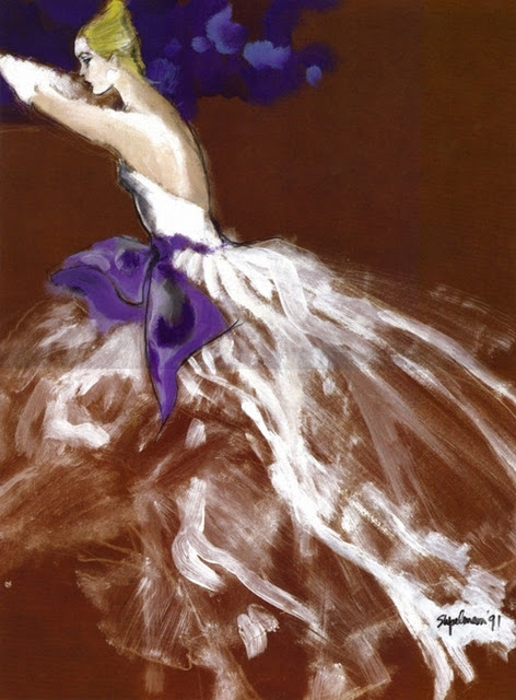
Here a few fashion illustration that I enjoy. The styles are different but they are all watercolour and pen based which makes me want to develop that skill. 


Skribbly effect. This looks like it was a quick drawing with a few pen stroked and paint brushes. Unlike the image above, the next one is very detailed and precious. The shininess of the hair and the glitterness  of the dress is very well portrayed for a black and white drawing.


Blank and white pen vs colour pen using hatching techniques. I think I have to go for the colourless drawing, It has more impact for me. The model's face is more intense.


The ink blob as background work amazingly , especially with the model's pose and the touches of red is what makes this drawing work. Strong and simple all at once.


Digital vs Brush 

The image below is very powerful due to the special effect on the eyes and the " smokey" waves but I believe the top image has a bit more flow. The stokes are more natural and spread out. The model's eyes still have the intensity needed for this illustration. 


Artist 

Stina Persson is inspirational. Her work( below) is about colour, dripping, shape, cut out ... 


Her style works well with portraits but also with landscapes !