This was a celebration of interior, furniture and product design
across Scandinavian countries, especially Norway.
The event was held on Saturday for the industry people/students and on Sunday for the public.
There were presentations, events, installations, discussions, lunches ... across shops, offices, showrooms, schools and museums.
By the way, check out the design using red a white, no black but still my favourite colours together.
The whole city was involved and participants could hop on and off the specially planned bus.
Bags and magazines were offered as well as drinks and food :)
So here are the things that caught my eyes as I walked through the city and the different areas that were part of the event.
This is a lamp design by a young MA student
called Andreas Bergsaker. I loved the objects straight away and was attracted to the mixed used of steel and wood.
He told me how the pieces were made and explained that an old oak table meant for destruction was used for this project, hence the name Reincarnated Wood.
I believe this chandelier is made of twisted glass tubes. What I like is the glow and the shadow it projects. The green, natural background is a true contrast to the style of the lamp but it actually work!
 This is apparently a SPAGHETTI wall and the name is suited. The aligned wooden stings acts as a room dividers. I really like the concept but would personally add a touch of colour or even imagery to this design.
I loved this metallic curtain especially because
of it's round frame. Simple and industrial but still elegant!
This was an interesting wall installation, especially with those shadows! I think it can be used as as decoration or it can have a practical side. These pivoting wooden hooks could be used to hang coats and probably more.
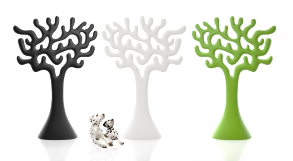
This design winning outdoor feature from Eero Aarnio is very graphic and can be used in public settings as functional art. If these could light up that would be amazing!
Now what I like about this next picture are the wooden stumps used as low tables. This is a very organic, plain design and it is in contrast with the red, bright velvet couch.

These two cut out pieces of felt grabbed my attention because of the potential they have as room separators. I think the shadows they will provide in a dimmed lit room could be amazing. would prefer them in more subtle colours like white, beige, grey, nude...

Blocks of colours are always interesting to look at. In the case of this modern bookshelf the colours are well used unlike this De Stijl inspired unit that looks like a crayon box .
The Spike chair by Swedish design Alexander Lervik is a pretty cool design. I personally don't like the fact that it might promote cigarettes but I cannot deny that it look very graphic and eye catching. I would love to see it in a unique colour or a uniform pattern.
You can see that the work process was also exhibited. It was good to see a designer's inspiration, sketches and technical drawings in this arrangement. This told the development story in a very easy and unfussy way.
I also saw other chairs that I really liked from the same designer.
This one is called the Eye. It is also available is leather and many other types of fabrics.
This one is an award winning chair called Rib and it has two special assets.
 It can be stalked easily whiles retaining a strong graphic touch.
 It is made out of felt and the structure of the chair is mounted underneath, within the felt.
As I was wondering around a trendy neighbourhood, I found some pretty cool street art in Oslo.
A vintage market
And a retro car
Thanks to my sister I had a partner in crime for this adventure!


